By Hadley Keller, Senior Editor with House Beautiful
Spoiler: Size matters―when it comes to your kitchen island, that is. Designer Julie Kantrowitz knows what makes a home sellable.
For a recent spec house (short for “speculation,” that is, homes builders create without a buyer yet on board) she designerd with builder Bob Gallo of Chestnut Hill Development, the New Jersey-based founder of JK Interior Living looked to the projects she’s designed for clients and her knowledge of the home market to create a family home that is at once elegant and livable. For the historic property in Ridgewood, New Jersey, Kantrowitz “basically went down to the studs,” the designer recalls, retrofitting a 1932 building to create a contemporary home that maintains the charm of its original era. In the process, she demonstrated some of her best learnings about creating a comfortable home that’s also ripe for eventual resale.
Make Room for Family
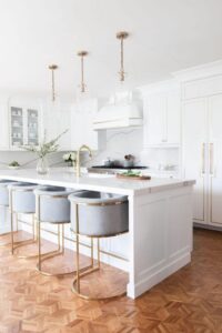 We’ve all heard it before: The kitchen is the new family room. Between open-plan spaces that merge the eating and living spaces and the ubiquitous kitchen island that begs pulling up a chair, the kitchen has never been more the heart of the home. And as such, it has to be able to accommodate any and everyone. “A bigger kitchen is in demand for sure,” Kantrowitz says. “With a large island—trying to accommodate as many seats around the island as possible is a big thing.” This is especially true for larger family homes, where buyers expect that all residents—and a bevy of friends—can sit together. “If you’re looking at 5-6 bedroom homes, logically, they’re for families of, on average, 5,” Kantrowitz says. “So you want to make sure that the kitchen can accommodate these larger families.”
Don’t Forget Utility
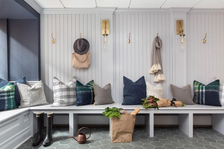
Another thing bigger families need? A place to throw keys, backpacks, and all other manner of ephemera that a growing brood attracts. In this home, Kantrowitz carved out a mudroom from a previously unused basement space—though she’s had clients go to even further extremes for this kind of space: “People are adding on additions literally for the sake of having a mudroom,” says the designer. “Everybody is looking for mudrooms now, whether in new homes or older ones. That’s another example of what I did to kind of modernize the home to make it more attractive to younger, larger families.”
Since this space is primarily a functional one, Kantrowitz ensured lots of storage, and added a table as a catchall for keys or mail. She covered the floors in slate for their durability, a decision echoed in the bathroom, where the designer nixed marble in favor of quartz, which better withstands daily wear—for no aesthetic sacrifice. “Quartz now is manufactured so well that it’s becoming a legitimate alternative,” she says. “It’s not grainy up close; it has beautiful characteristics.”
Get Creative with Usage
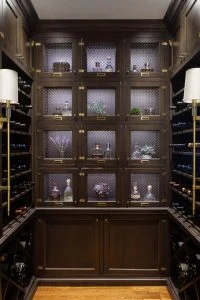 If a space isn’t used: Think of what would make you use it more. In this case, Kantrowitz turned an overlooked side space off the kitchen into a butler’s pantry and a statement wine room. “We’re asking ourselves, ‘what are the features in a forever home that we’d be interested in?’” explains Kantrowitz of her decision to spring for these types of spaces. But make no mistake: Just because these rooms become functional for storage doesn’t mean they can’t be beautiful. The designer created custom cabinetry with chicken wire fronts—to add a sense of depth in a shallow space—in the wine room, and then accessorized with statement sconces from Hudson Valley Lighting. Meanwhile, in the butler’s pantry, glass-front cabinets make for storage that doubles as “an intentional accent,” explains Kantrowitz.
Preserve the Best of History
“At every opportunity I kept the original,” stresses the designer of the home’s historic attributes. That meant maintaining the kitchen’s parquet floors and the jaw-dropping leaded-glass windows in the master bath. “I personally love older homes,” she explains. “I love to incorporate the charming details that were original to any home. A lot of these details, if you do it mindfully, you can update in a clean and sophisticated way without compromising on the original design.”
One surprising example? A certain dated wood in the mudroom that Kantrowitz found to be a surprisingly pleasing pair with the new design after a simple refinish. “In the ’90s there was this very specific wood color, this kind of shiny oak, and people cringe when they see it,” the designer laughs. “But when we sanded it down and put a clear coat of poly on it, we found it works really great with grays and blues in that room.”
When the original does feel too dated, consider updates that still tie back to the classics, like Kantrowitz did in the master bath. “Some things are just timeless, like herringbone laid tile, so I’ll do wider plank herringbone to make it feel cleaner but still have that classic look,” says the designer.
Use Your Space Wisely
While it might be tempting to chop larger closets and baths up to make multiples, Kantrowitz cautions homeowners to think twice. “For this home, the master bath and the master closet used to be a his-and-hers,” she says. “The builder wanted to keep that layout and just update it, and I said I’d prefer to have one really large bath and one really large closet. While the his-and-hers is popular, you are still compromising square footage. It’s not necessarily something I recommend.”
The larger master bath affords space for a freestanding tub, which emphasizes the original windows and lends the space a grand, luxurious feel—much better than two cramped baths.
Ensure Good Flow
Any designer worth her trade discount will tell you that a good flow is the key to any well-loved space. Here, Kantrowitz ensured that both with floor plan and visual cues. “The family room is immediately adjacent to the large kitchen,” optimizing traffic between the two most-used parts of the house. Meanwhile, in the powder room down the hall, the designer explains: “I wanted the space to feel connected to the rest of the house, so instead of beginning the tile at the door frame, I decided to tie in the hardwood floor as a border surrounding the tile.”
Don’t Be Afraid of the Dark
A dark navy on cabinets in the laundry room may come as a surprise, given that white and cream cabinets have become a go-to. But Kantrowitz is a fan of a little darkness. “I’ve been using black and really dark navy a lot lately, and I love it,” she says. “In just the right dose I think it’s so sophisticated and chic—if you do it in small doses it’s not overpowering.”
It’s O.K. to Make a Statement (or Two)
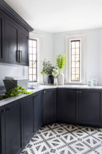 Another eye-catcher in the laundry room? The patterned floor, courtesy of some high-impact cement tiles. “Everyone wants to do something fun and creative, but nobody wants to take those types of risks in a foyer or a main space, so the best applications for those types of creative and unique materials are in rooms like a laundry room or a mudroom, or a child’s bath,” explains the designer. “It’s something that’s not in viewable sight but that you’re in often enough to enjoy.” No further argument needed.